
WENDELL & WILD
The work i got to do on Henry Selick’s Wendell & Wild was unique and rare compared to other projects. I have been a fan of stop motion for a long while and missed a few opportunities in the past to work with Henry. It was luck and good timing that I got to help a bit towards the end of picture.
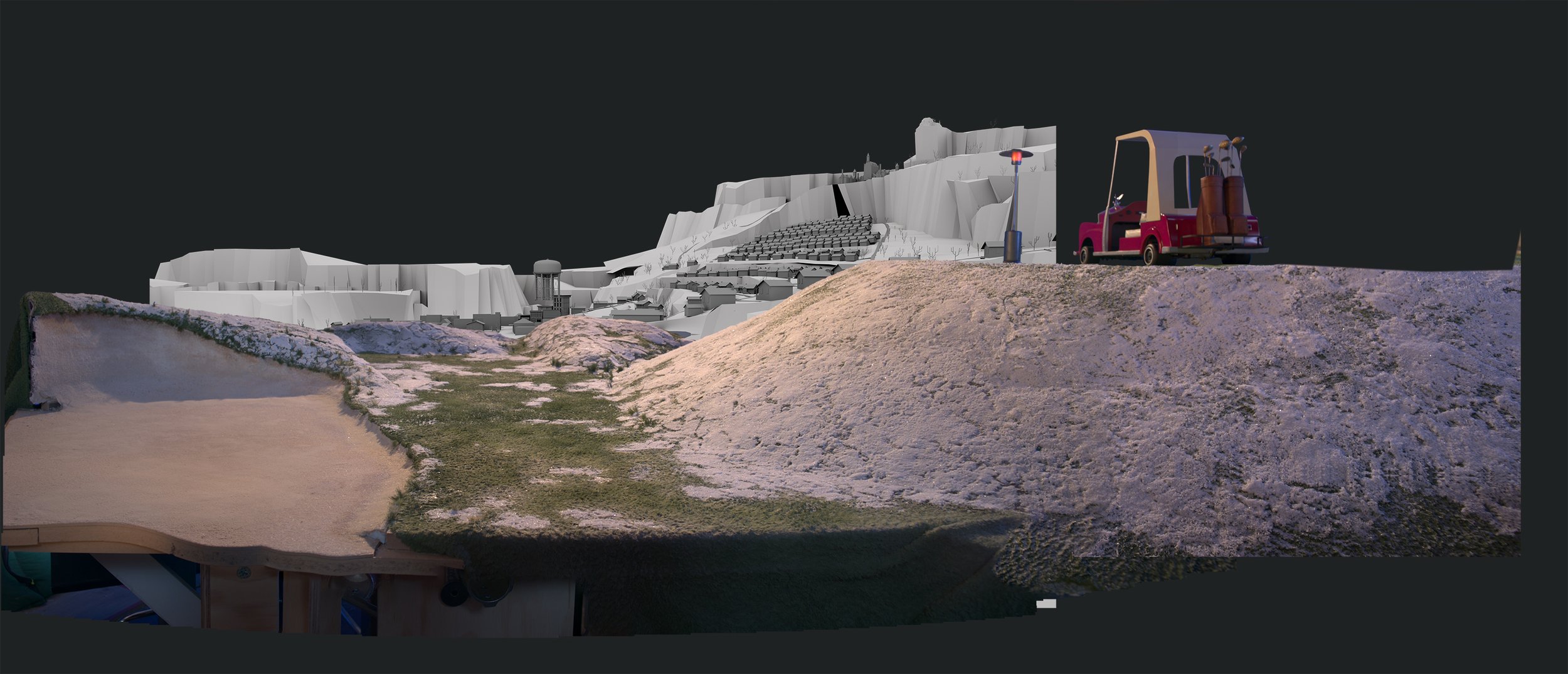
My involvement came pretty late in the project. The film was enormously affected by the pandemic, the wild fires in Oregon and much more. The shutdowns paused a lot of set development, which led to extensive use of bluescreens. My time on the picture involved working with Henry in proposing looks for the final frame. How mattes & skies would affect the exteriors and how weather & color could move through the entire picture. One part of these proposals took the form of paintovers of filmed plates. The other was a colorkey version of the weather/clouds as it progresses through the film. There were small comp tests to communicate some ideas in motion and audio pitches for the potential sound design could play.
A lot of visual inspiration was the early art and colorscript by Lou Romano ( Production Designer ) and the beautiful concept art by Kenny Leoncito.
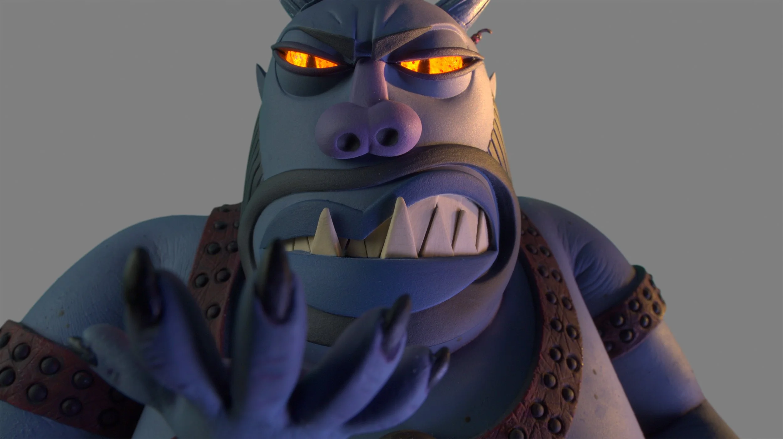
The knock out character designs in the film were done by Pablo Lobato. The final sculpts and puppets were faithful interpretations of these designs. My sketches on this page are based on these. Likewise the paintovers below were done on top of beautiful sets built by the incredible crew. Tom Proost, Matthew Brooks & Jason Lajka were the Art Directors for these gorgeous sets. The plates were beautifully lensed by Director of Photography, Peter Sorg and team. The lighting in the stage plates were often strong cues for the choices in the paintovers.
Budget and time constraints meant the team had to be very selective about what in these proposals could make it all the way through post. What follows below is a brief overview of some of my work.


Paintovers was one of the approaches to search for a final look of frame. These were done with a level of restraint in mind. What was added could enhance mood and feel of the shot, without losing any of the great work that was already in the plate. The layering and breakdowns were done in a way that could find an analogue in compositing .
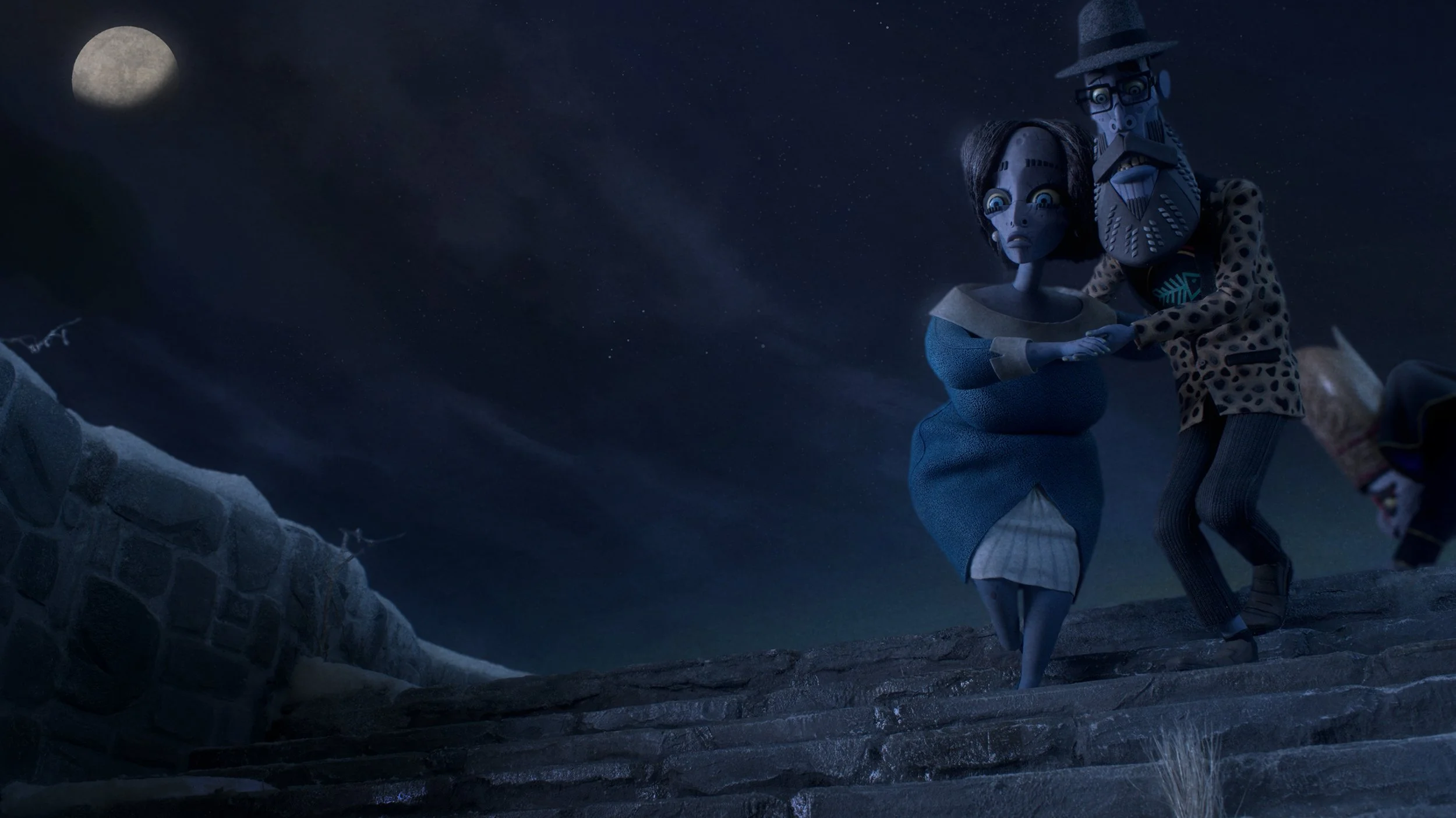
The first paintover was this shot of Kat outside RBC. The additions here were taking cue from what already existed in plate, and in the story. We come into RustBank in late winter with snow still covering a good part of town. The weather allows for hanging fog and mist which can affect depth. The roads and surfaces can have some of the reflectivity that comes from meltwater and scattered snow and ice. The ambience is grey and overcast . The layers of fog affect any artificial lights in plate and cause them to bloom. ( such as the interior RBC lights )
This shot was composited quickly and successfully following the notes and paint overs. In the compositing pass of this shot, there was extensive use of roto. This approach was cost prohibitive for the remaining shots. A good way to think of the plates were more close to live action rather than animation scenes in 2d or cg, where every element is separate. A similar breakdown of steps was created for all paintovers that followed. It remained a good way to pitch concepts and communicate the thinking. A caveat for future paintovers was to favour additions and solutions leaning towards overlays, use of masks and full matte backdrops.
( + personal inspiration in these early paintovers was the photography, use of light and shadows and texture from the Terrence Davies movie ‘The Long Day Closes’ )


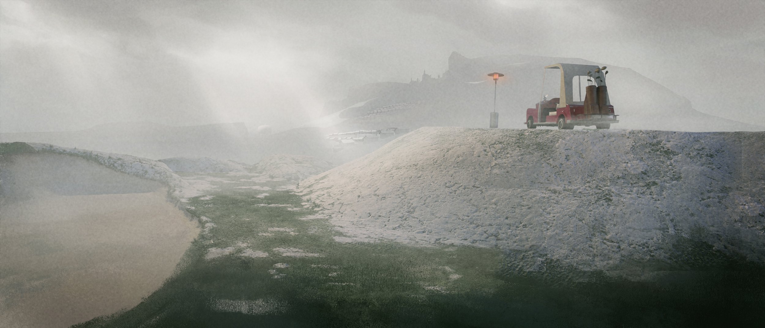
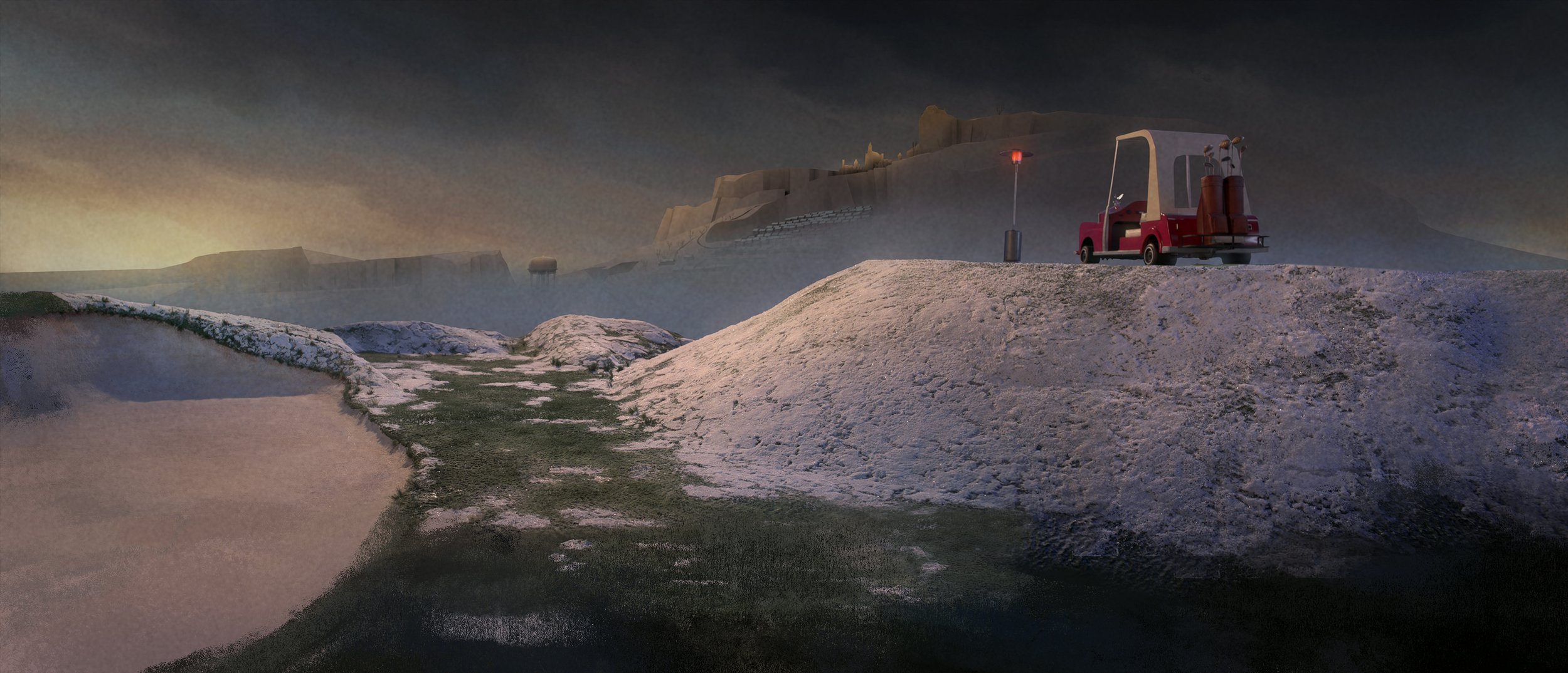
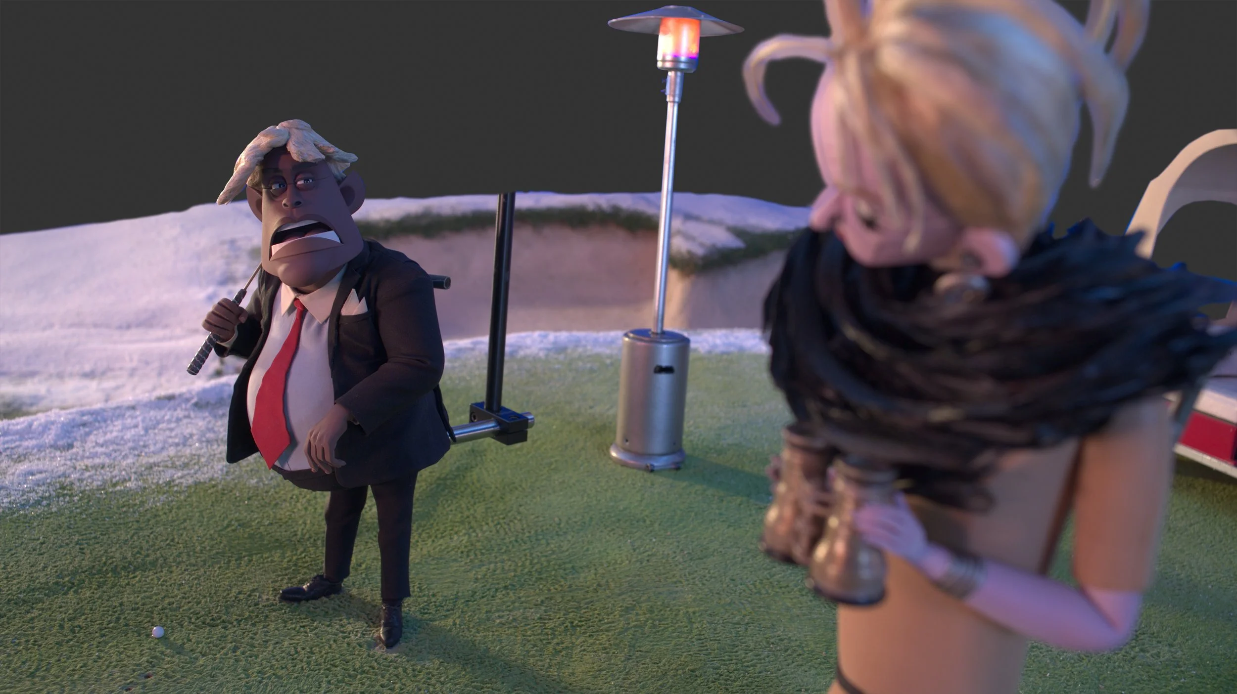
Fog became a big element to play with in the golf course scenes. The clouds having a bit of movement would allow for little pools of light to break through. One of the ideas with Father Best’s murder scene was to play up the amount of fog in the plate. It spoke to something deeply sinister that the Klaxons would commit a murder in daylight. The pitch here was, similar to a crime in the shadows, the thickness of the fog become the cover for the murder.


Weather shifts and changes were baked into the story in a big way. There was a detailed text document prepared by Paul Harrod ( Production Designer ), that tracked the weather and phases of the moon through the story.
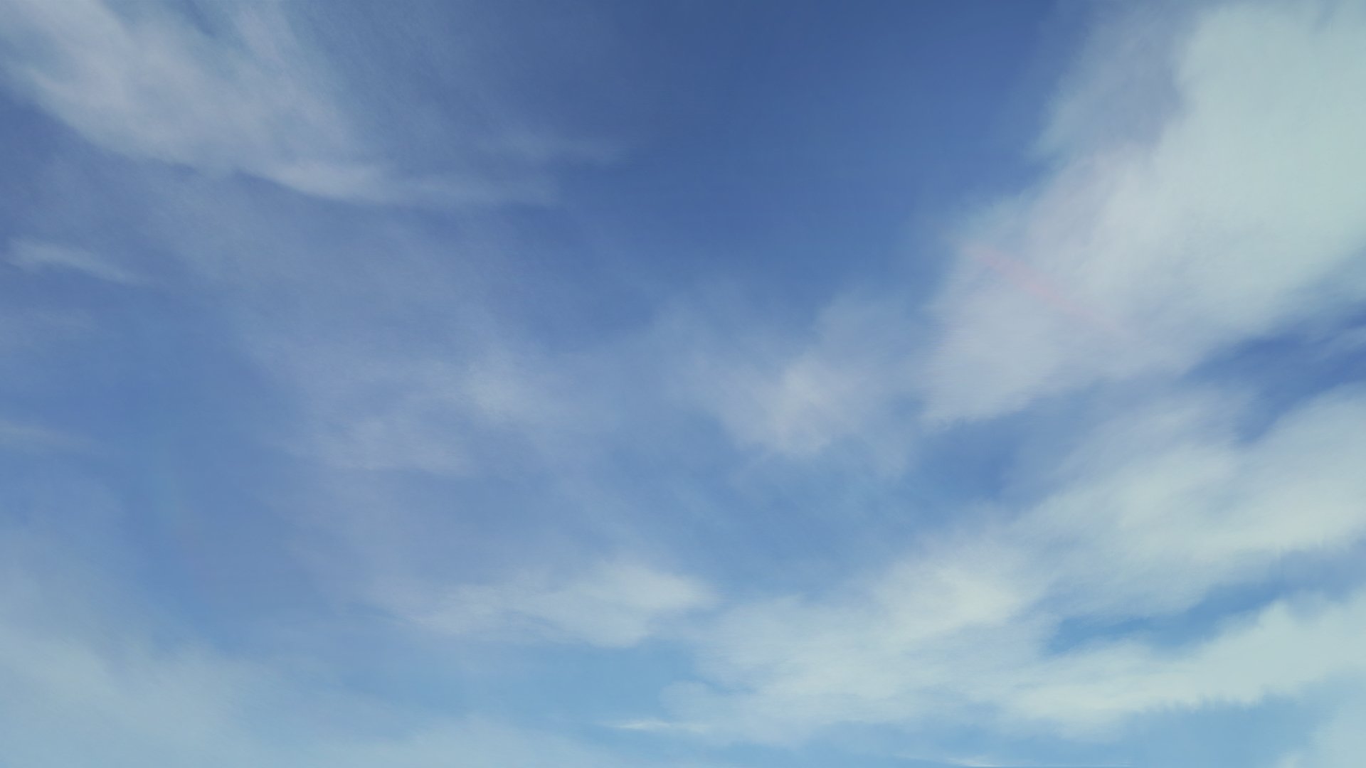
The attempt below, with Cloud maps, was to create a visual version of the exterior skies & clouds and track the weather through the entire film. It served as a proxy colorscript for the exteriors of the film. This became an evolving document which could be adjusted as shots were being completed on stage for animation. The cloud map also gave an opportunity to create distinction and variation in the night scenes. Cleaner purer blue hues at the beginning through Kat summoning the demons , moving to murkier muddier purples in the middle of picture, all leading to a more high contrast, almost monochromatic night sky before Belzer rises. Finally the sunrise brings color back into the world once again.

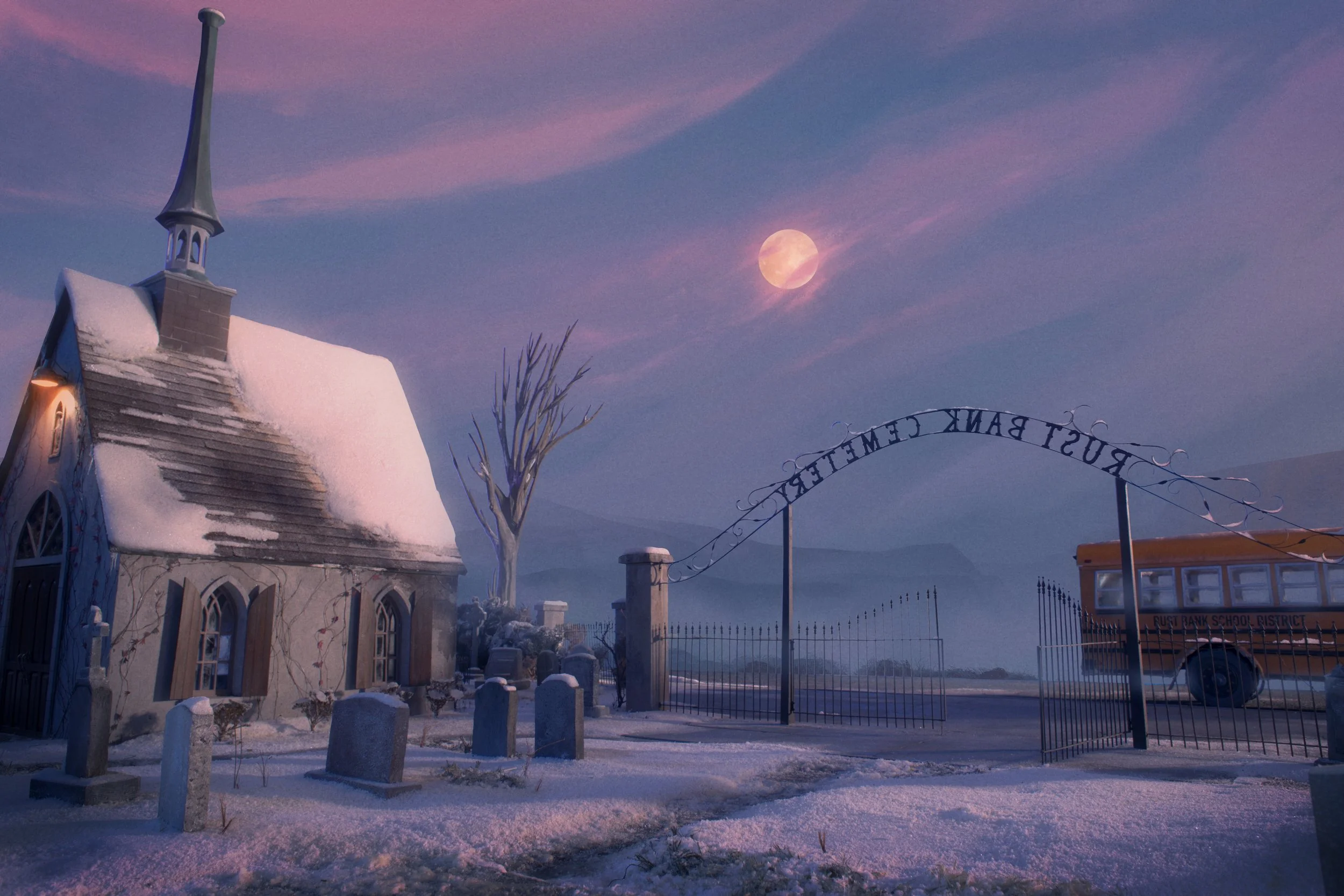
Having the Cloud map helped with paintovers involving extensive skies. It became a quick reference guide for the key exterior moments. In this sequence at Father Bests’s funeral, the color cues also came from the set lighting in the plate.

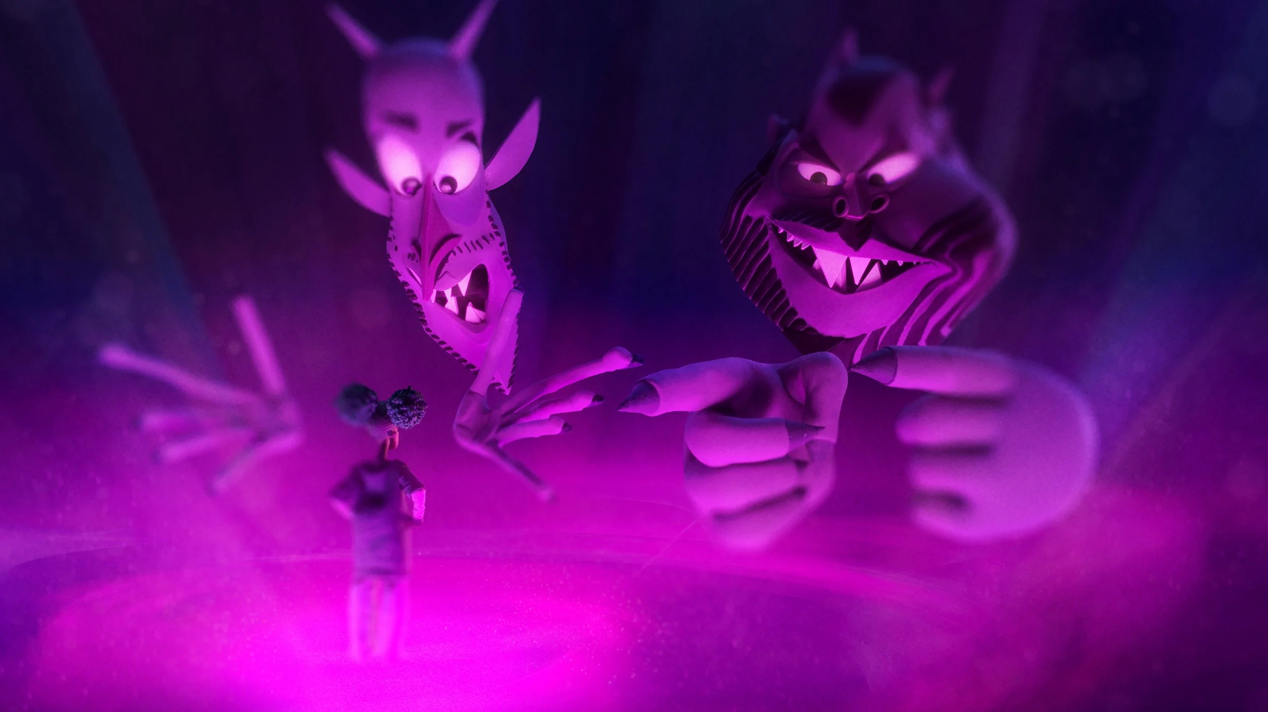
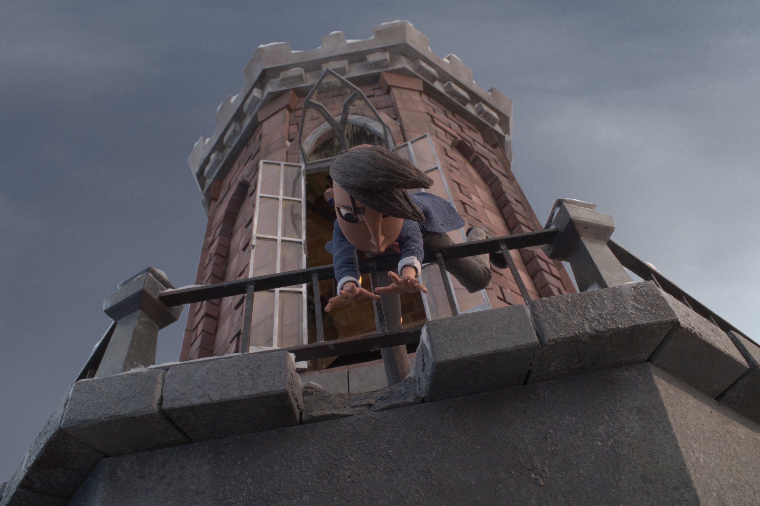
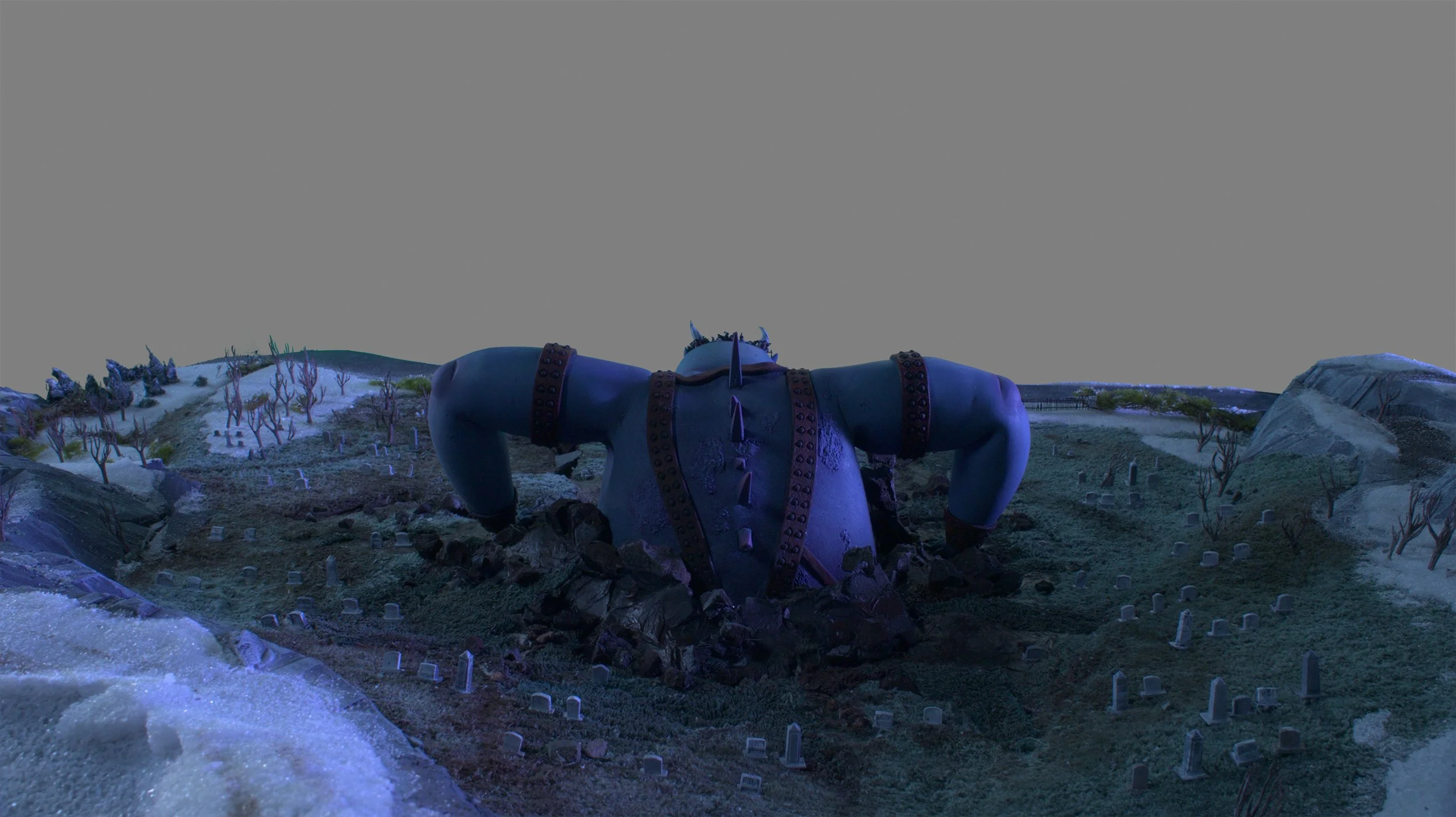
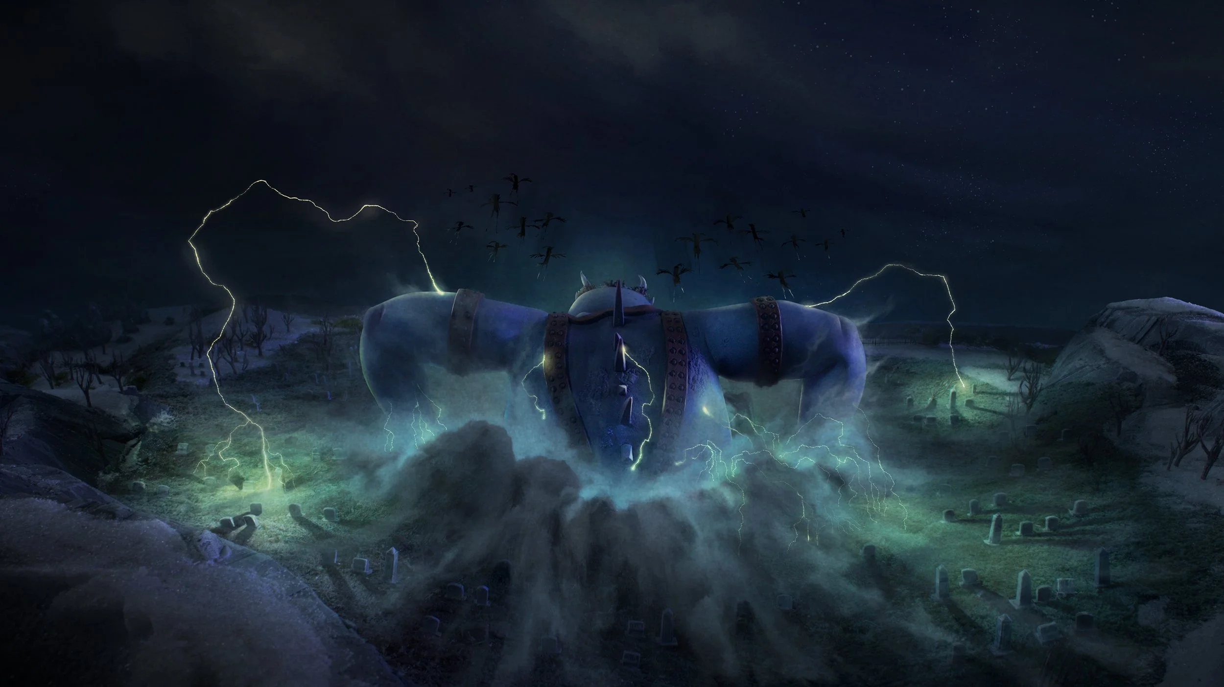
The void where Kat meets the demon brothers for the first time, is one of my favourite sequence from the film.
My reaction seeing this for the first time was ‘ How the heck did they do that'?'!’ The puppet heads of both Wendell and Wild have this bouncy fleshy quality . I believe the brilliant character animation here is by Juan Soto. ( as an aside, if you stay through to the very end of credits in the film, there is a little treat )
The sequence was already final, but i got to test out a short experiment .


One part was in paintovers. The other was doing a test comp by taking a small section of the sequence into aftereffects. The textural idea was adding lightrays & particles that played into the dreamscape atmosphere. The conceptual ideal was to play with a post depth of field pass. To have the focus be affected by the collisions and movements of the two demon heads when looking at Wendell & Wild. When the camera was on Kat , the lens focus would shift evoking a sense of breathing.


Redemption chamber was another beautiful sequence in the film designed and headed by Kameron Gates.
Very briefly i got to make a few paintover proposals. One part was to introduce a bit more yellow into the mix at the beginning and progress to the full green. The other was a proposal for the beam of light to kick up dust and particles in the space . Something that would build around the final portal as Kat’s demon emerges. Even though these ideas for the void and redemption chamber were a bit late for comp and vfx, it motivated some thoughts for sound later on.
The use of light rays found a place in the Sequence when Kat visits the graveyard on a full moon night. In the plates from the stage there was already suggestion for the shadows cast on the ground to subtly flicker and move. Using this as the cue , the thinking in the paintovers were to show the lightbeams dancing and shifting subtly as they break through the tree branches. There was also layers of fog more close to ground. This was used to build a sense of depth with the background elements in the plate.


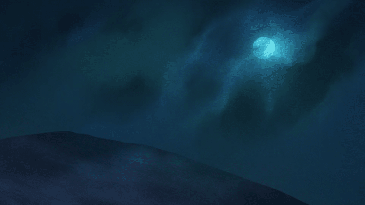
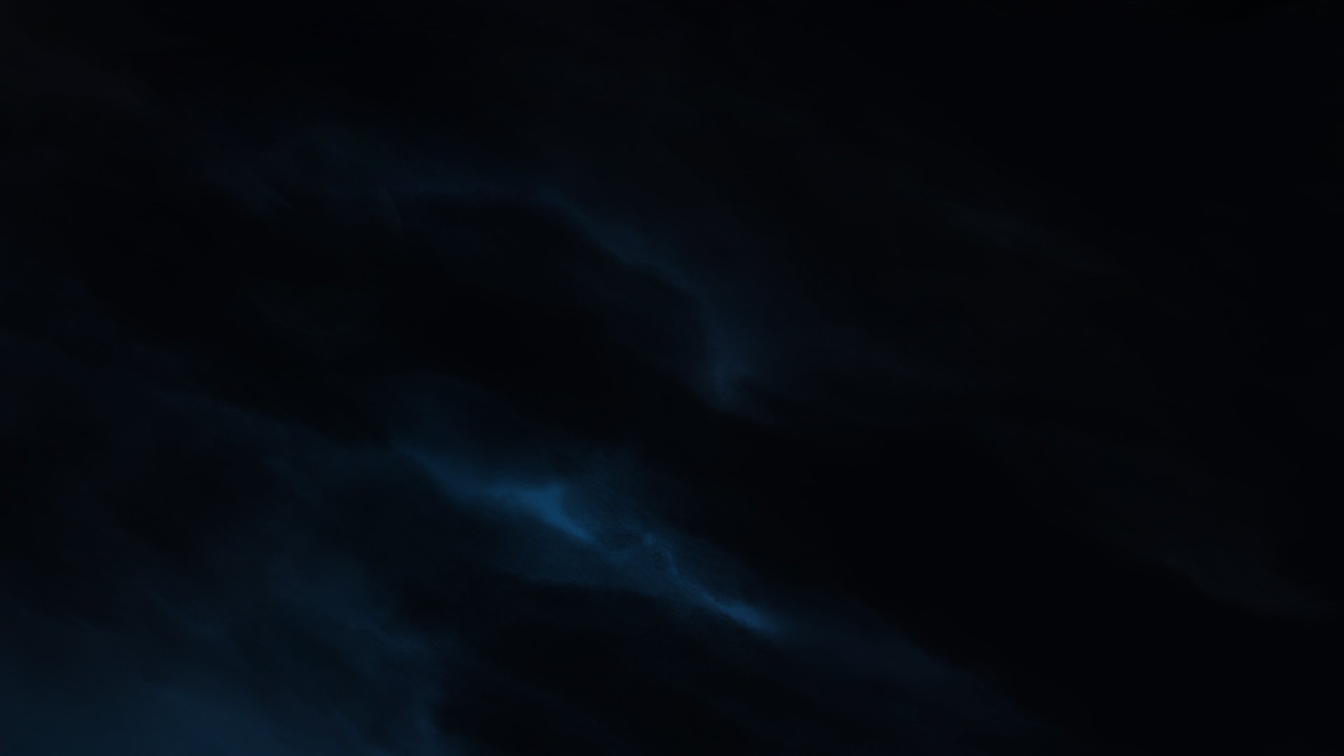
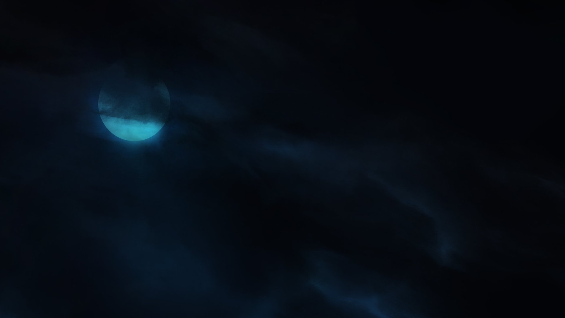
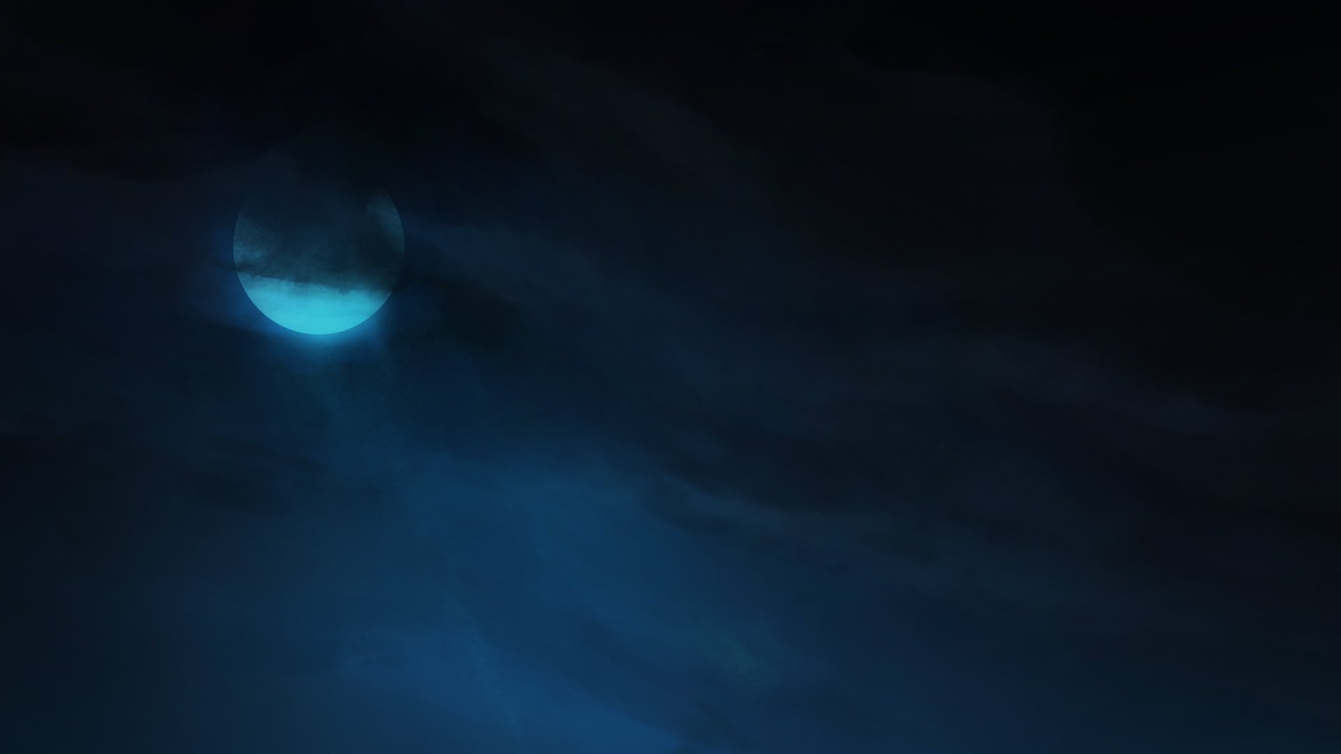

The motion videos were quick tests to show how the clouds would layer and move over the full moon. These were done in aftereffects. It was also a quick way to look at the cast shadow effect of the clouds on the ground and give a feel for the dance of moonlight breaking and weaving through. For a few sequences, additional cloud paintings were done similar to the cloud map to show transition and change of mood and color . The pieces above show the transition post-summoning. The night sky is covered by thick black clouds which slowly drift and clear over the following shots to once again reveal the full moon.
These paint overs and motion tests were done for the lead up to the bridge accident . The tonal idea here was to go from a calm late evening at the brewery to a very rough storm on the drive home. The intention was to give a sense of a storm brewing as Kat’s parent’s look out the car window.
A churning of clouds , with lightning flashing underneath. It had to create the mood and feel, without competing with the other stormy sky in the film, the summoning. Color wise it leaned a bit more towards monochromatic.


The paintover for the wide view of RustBank was done over a CG render. The CG pass of this wide view had the map and geography in place of all key town elements. With the paintover the hanging fog and clouds cleared enough to show the desolate town below. The highlight was also on the bulldozers in place setting the stage for the final battle. An additional idea here was to also show change in weather with the thawing river.


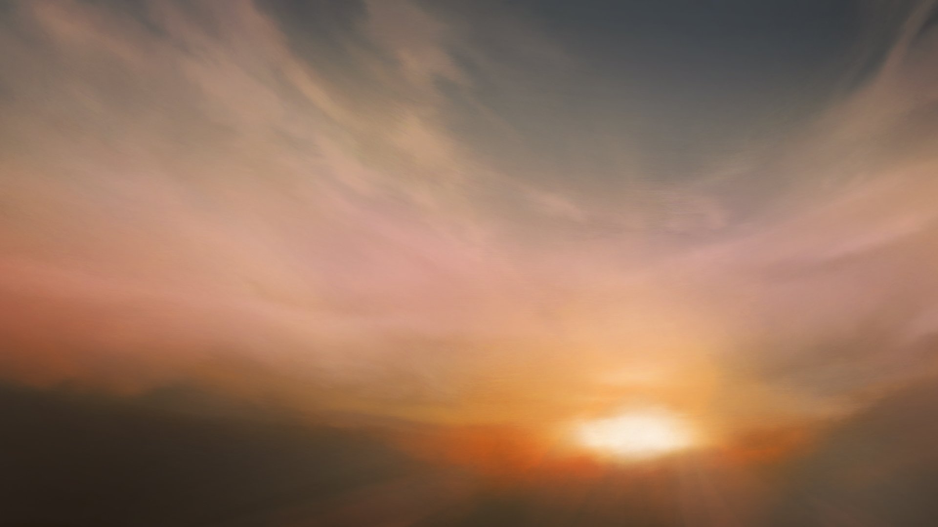

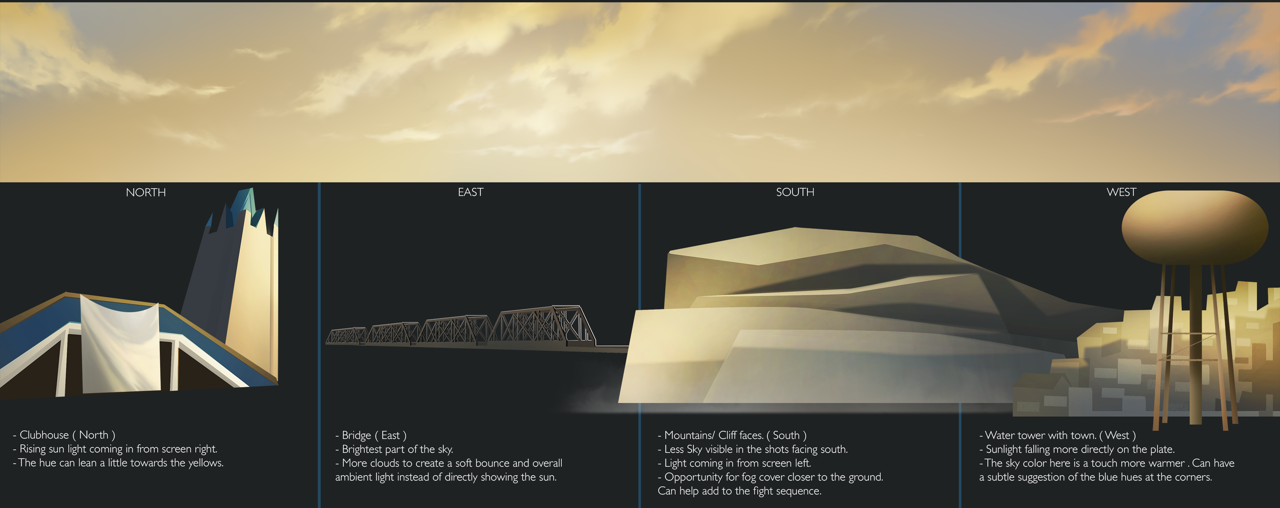
Belzer rising to the land of the living coincided with the first ray of sunlight coming through. In the first draft of the cloud map the reveal ended with a full sunrise and moved to a clear blue sky. This changed as the sequence with the bulldozers got finalized. The final draft of the cloud map landed on an ambient sky with a mild yellow tint.
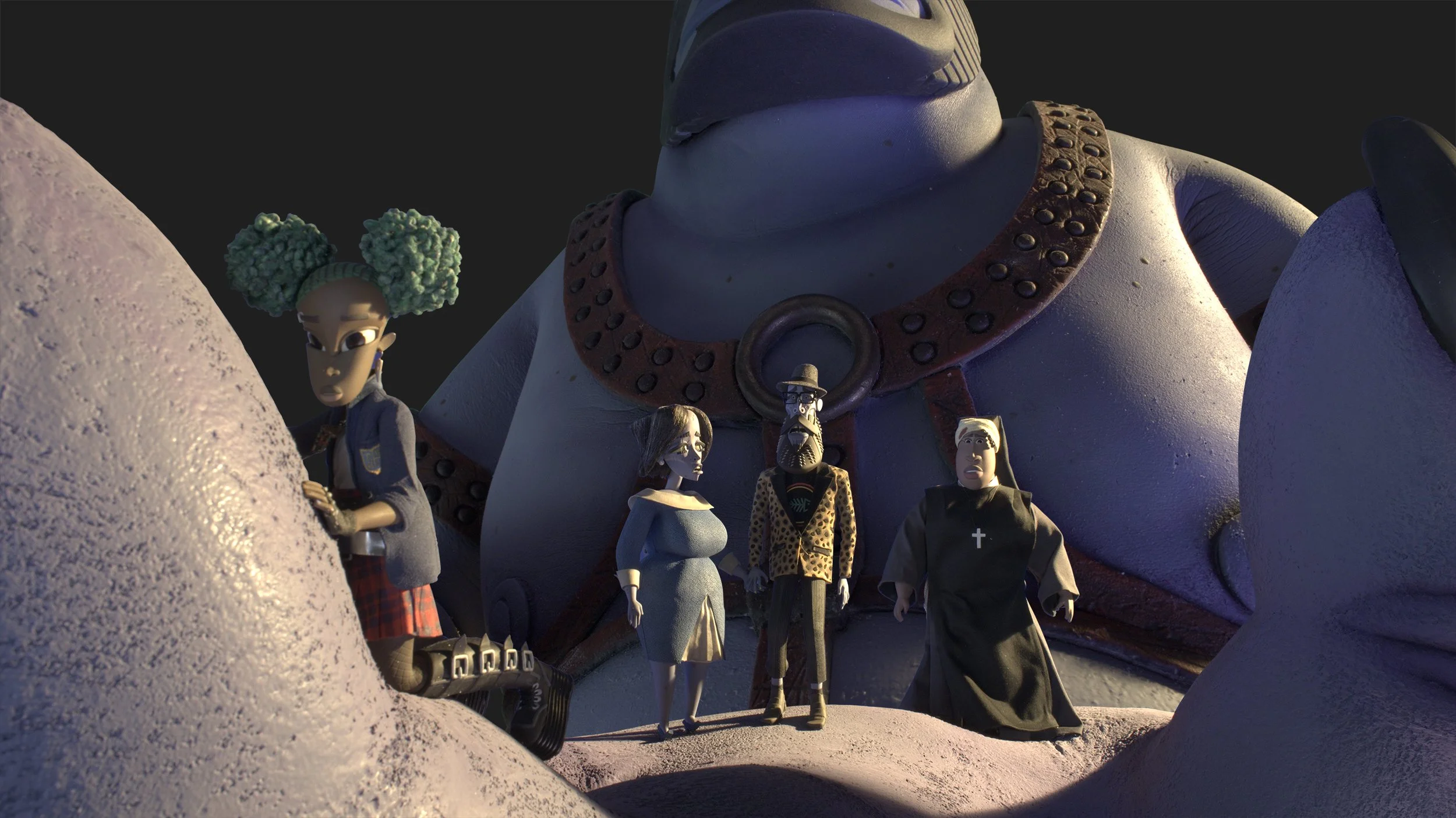
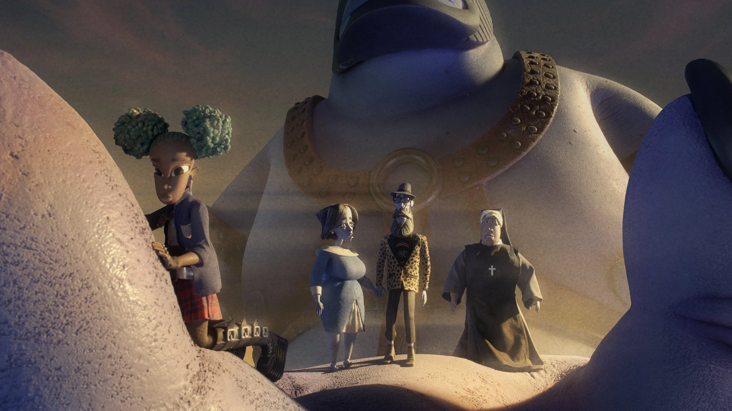
The crew while filming, had made notes for direction ( North, South , East, West ) on the bluescreens. The updated cloud map was paired with a basic note of main town elements that faced these directions. This was a way to track the action and make sense of the environment as the battle got underway. Keeping the light and ambience mostly constant here also avoided confusion when cutting during the action scenes.
All of these provided reference to the matte crew and post team. Some of the beautiful final mattes in the film were by Eric Urquhart , Stephen Bodin & team. The vfx crew were led by Mark Fattibene and later by Heather Abels.


The final bulldozer battle is set during the first sunrise in the film. The hanging fog has cleared up with distant mountains more visible. The paint overs point to more information in the background and foreground. The constraints to keep in mind with the sequence was, to find a look of frame that did not involve fx elements that interacted with moving plate elements. It had to be something that could be overlayed or play behind the plates.
The idea in the paintovers was to play up the smoke that is being spewed out of the bulldozers. The smoke remains suspended in the air creating a hanging mass of black clouds, which affects the light filtering through. Added to this was soot and dust particles. The black smoke could push the lights more towards the reds, and accent the battle atmosphere.


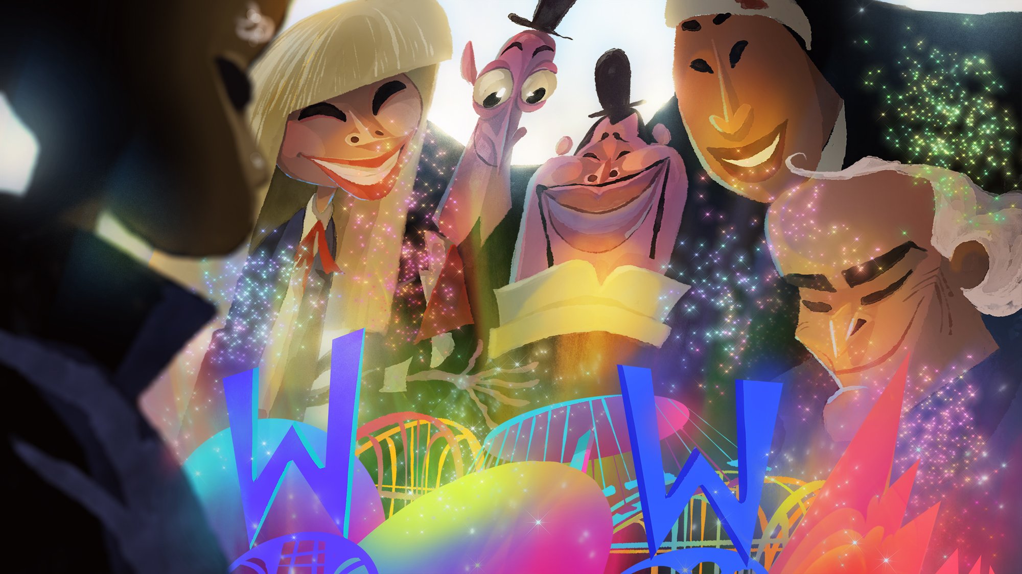
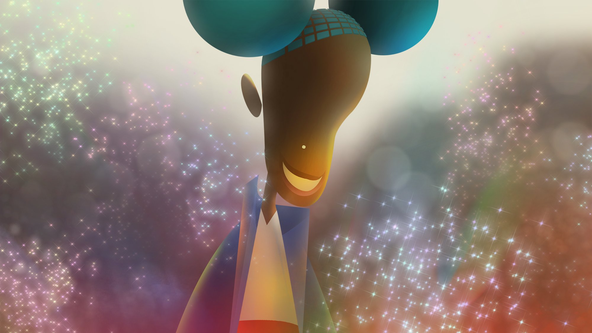
The Dreamfaire ending was different to the paintover approaches. This sequence hadn’t been filmed yet and the team was looking for art. There was a fully realized functioning Dreamfaire paper sculpture, which unfolded as seen in the film. Henry had commissioned artist Peter Dahmen , who built this beautiful piece. The idea was already set in place to end with a colourful play of light.
The turnaround was very short since the sequence was moving quickly to stage. These concept pieces were created to visualize the ending and how the colors would shift around Kat & friends.
( + personal inspiration here was a series of photographs by Rinko Kawauchi )


In the RBC clip, the cast voices are from the production reel. All other sound elements such as footsteps and ambience of space was designed for this pitch.
In 3 worlds the cast voices and Belzer’s heartbeats are from the production reel. All other effects and ambience were designed for this recording.
The audio pitches were motivated by a personal interest in sound design. In the instance of ‘RBC Interiors’, it was an attempt to check where can sound add to the tone and texture the narrative already had. What other way was available to show the age and decline of the structure and the financial strain RBC is under.
I did this first audio pitch unprompted…with possibly a good chance of falling flat on my face. Fortunately, Henry was excited by this approach and was open to more thoughts along these lines.
This led to ‘3 Worlds, Screamfaire & Dreamfaire pitch’. The attempt here was to look for areas sound could lead, where visuals were strained by time and budget. Opportunities that could add to the worldbuilding.
These are not aimed at final mix , but rather concepts.
( The audio files are best experienced on headphones )
What the world went through in the last few years wasn’t particularly kind to mounting an ambitious project like Wendell and Wild. Animation feature films of this scope and scale are huge tasks. If one arrives at the finish line with its heart still in place, what has happened is a bit of alchemy . The magic trick was made possible by the hundreds of names that scroll by at the end of a film. In this case stop motion wizards across many departments. Each in both big and small ways shaping and forming the larger puzzle piece. The process of making a film can be messy and frustrating. When the result works, the feeling also has to be one of the greatest thrills. In my short time on the picture, i got to briefly work with and see , from a distance, the craft of an incredible production crew. I have highlighted a few of them here, with links. This is by no means a full accounting of the many people involved or the degree of their contributions. I hope you will discover more, as their work comes available online.
Within the world of animation, stop motion much like 2d is a rarity. It remains a unique artform that demands a lot in process. Henry and team occupy a space where great sophistication pair with excellence in craft. The part of me that went in as a fan has come out the other end having fallen in love a little deeper with stop motion, with all the awe intact.
Much thanks goes to Julie Ragland for having me onboard. A great deal of making all the workflow happen as smooth as possible was also thanks to Zilpha Yost, Natalie Carroll, Elise Guillen.
During my time on the project i was given a lot of room to try and test different approaches to problems. It is truly rare to have such creative freedom and it speaks to an enormous generosity by Henry Selick, for which i am very grateful.
I hope you will enjoy Wendell & Wild.
Robin Joseph ( Co-Production Design )
